Designed OMS Application for Internal Team, resulting in savings of INR 2.2M monthly.
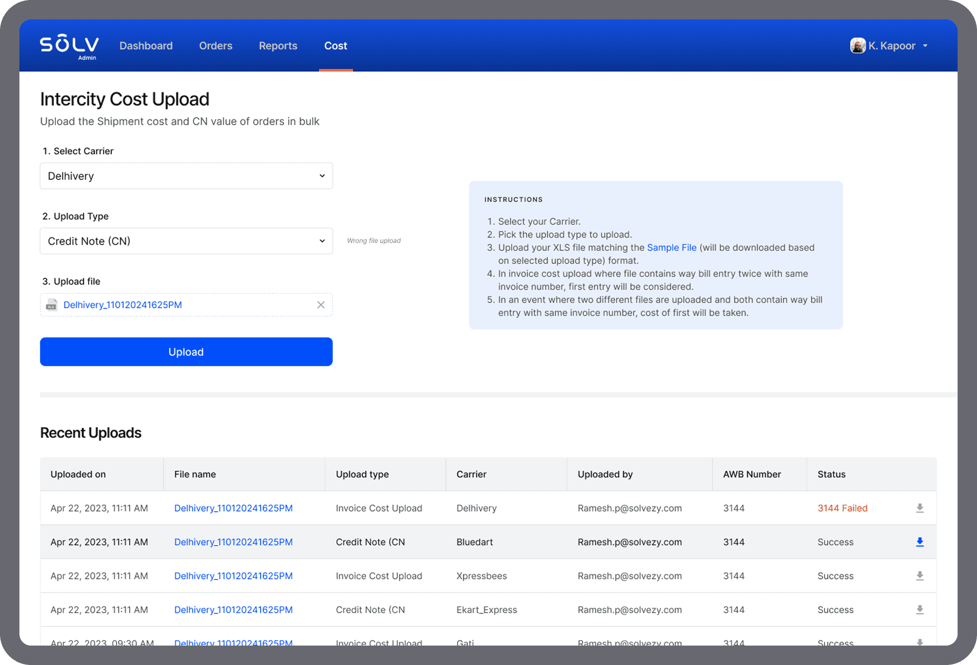
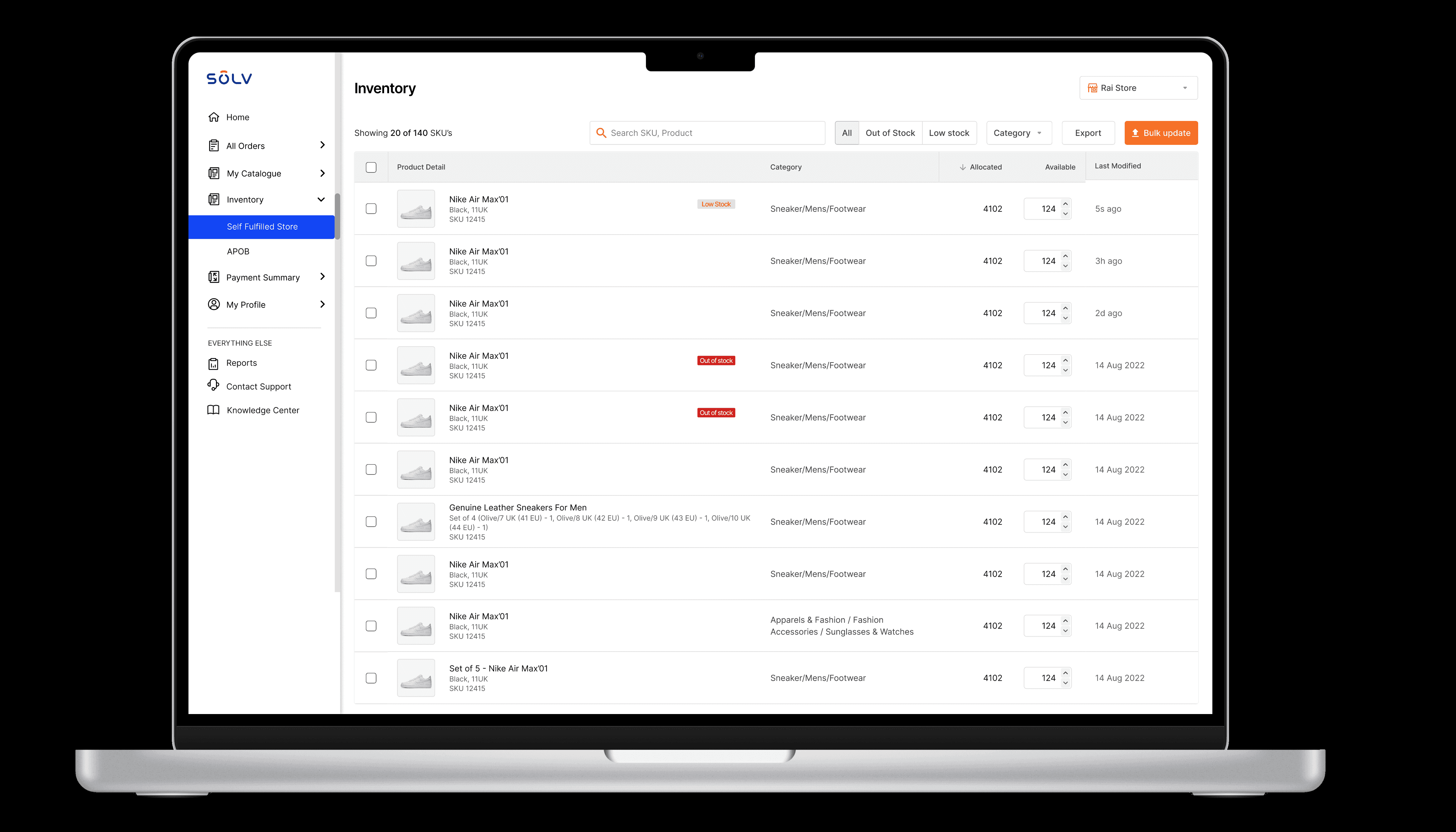
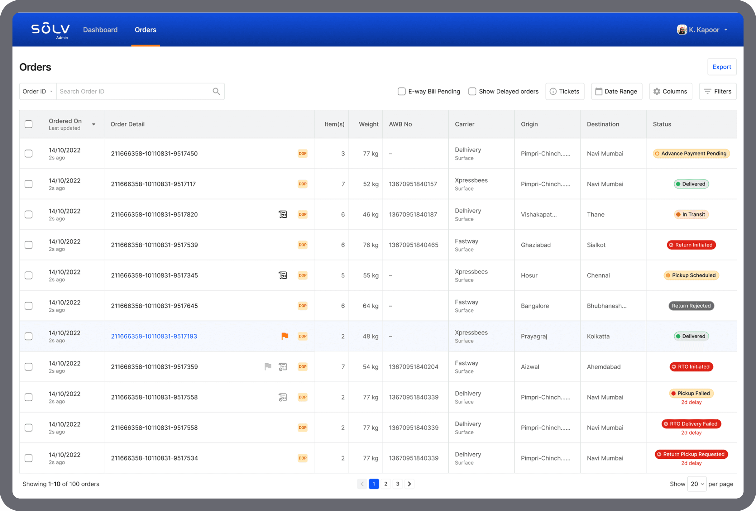
Strategised and designed internal tool to manage and process orders.
Role
Principal UX Designer
Industry
Supply chain management
Duration
5 months

Why build a tool?
As an e-commerce startup experiencing rapid growth, efficient order management was critical for sustaining customer satisfaction, operational efficiency, and scalability. The current reliance on manual processes, spreadsheets, and fragmented systems for tracking and processing orders presented significant challenges as order volumes increased and sales channels diversified.
Pain Points of Business
Inefficient Manual Processes: Manual order tracking and processing were prone to human error, slowed down fulfillment, and made it difficult to respond to urgent issues or exceptions.
Fragmented Data: Data from multiple channels (app, warehouse team, seller portal, 3P, etc.) is not consolidated, leading to discrepancies, missed orders, and a lack of a single source of truth.
Poor Visibility and Actionability: Lack of real-time dashboards and alerts prevented the team from quickly identifying bottlenecks, high-priority orders, or issues requiring immediate intervention.
Returns and Exceptions Management: Handling returns, exchanges, and order exceptions is cumbersome, leading to delays and negative customer experiences
The next step was to identify users and understand their KRAs. Users were divided into two categories. Few roles had visibility of all the orders but could not take any actions on them.

Interacting 1-on-1 with the team
It's imperative to understand how your users are going to use this application in their day-to-day life. Frequency of usage, reliance on the tool, the objective they wish to achieve from this tool, and how it fits in their existing workflow.

UX Strategy
At this stage, I had identified that the tool needs to be layered, robust and scalable. Multiple teams were going to use this as their source of truth. I decided to take a breadth first approach and later deep dive into depth as opportunities present themselves. Judicious prioritisation enabled me to focus on the key deliverables on time.
I have shared my framework and thought process in detail here.
Implementing ORCA Framework
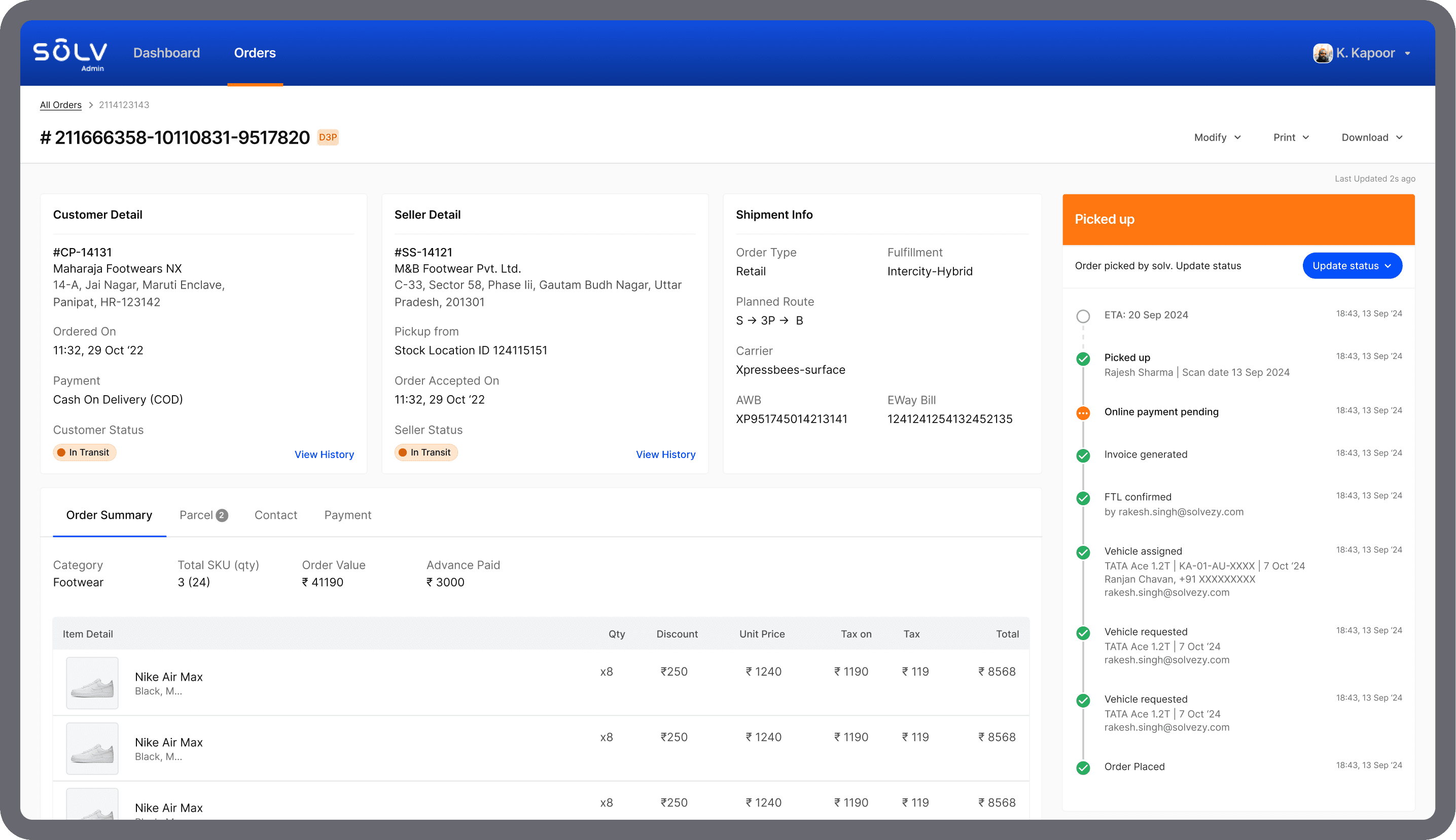
With the information collected from stakeholders and product managers, we were able to finalise the data that was a must display to the end user. At least for phase-I. I grouped similar attributes and mapped them to an object.
This helped me structure the information and layout of tool. Next step was to define relationships between objects. For example, an order contains seller, buyer, product info. Carriers are assigned after a milestone is reached. Understanding the connection between objects helped in creating a cohesive and intuitive user experience.
For each object, attributes (properties) were defined.
For Shipment details, attributes could include carrier name, AWB, E-way bill, fulfilment mode.
Actions were mapped to objects. For example, Shipment detail object → Change carrier.
This helps clarify the functionality needed and ties actions directly to the relevant objects.

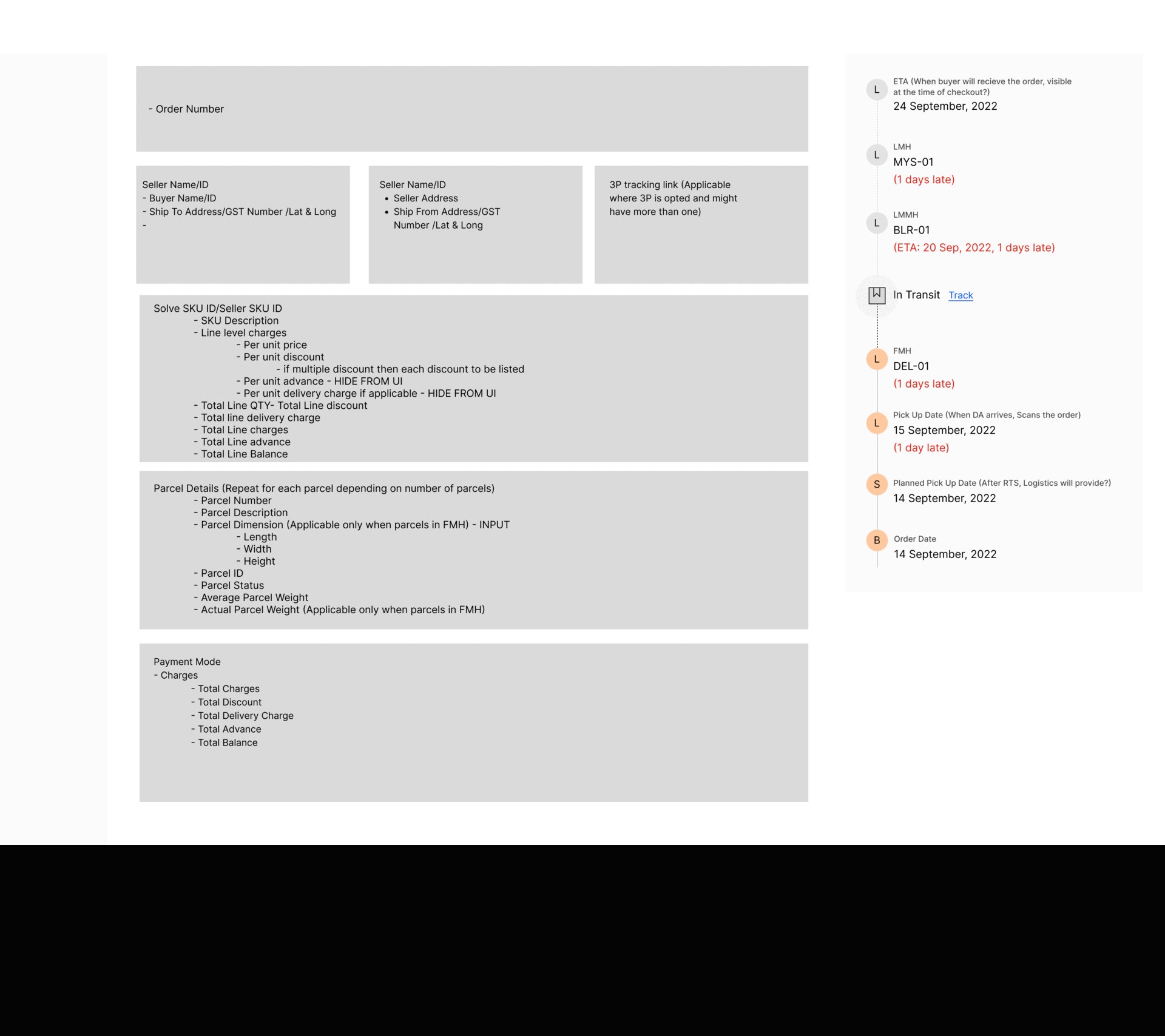
I shared my wireframes with stakeholders, developers, and product managers for feedback.
Wireframes enable to visualize objects, their relationships, and user flows. The early low fidelity prototype helps simulate interactions and test usability before development.
From the feedback received, iterations were made to the wireframes.
Challanges
The project was hindered by the absence of a well-defined product roadmap, leading to shifting priorities and unclear direction.